
I am SO excited to show you this before + after. This kitchen remodel was the top priority for us in this home- and the first project we tackled. I’d better show you what we were working with when we bought this home first.
The kitchen is behind this beige wall- you can see the fridge and top of the faucet from here. Unfortunately, the kitchen had already been renovated in recent years- but was just not my taste at all, and though there was an attempt to open up the space, it still felt very dark and closed in.


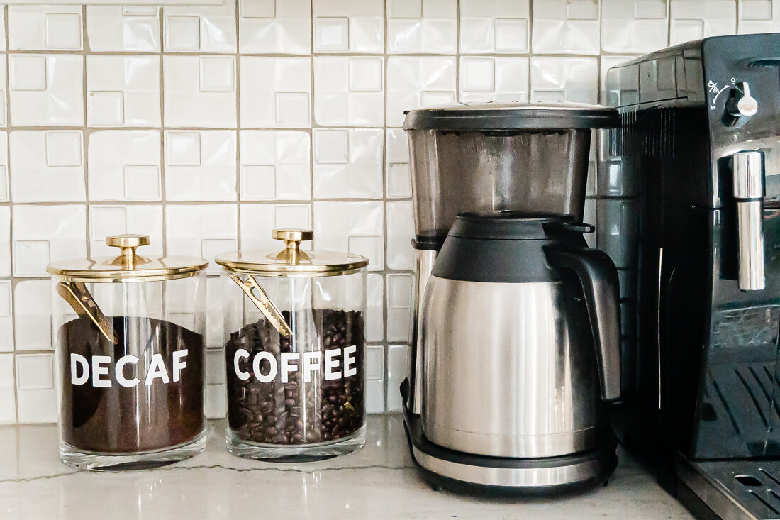
You can see here how the kitchen opened up into the back living space- but again, it just felt really dark and I felt it had the potential to function a lot better for our family with some reconfiguration. In the photo below, the far corner that has an air vent is where the coffee bar is now. Check out this post to see all the details on the coffee bar!

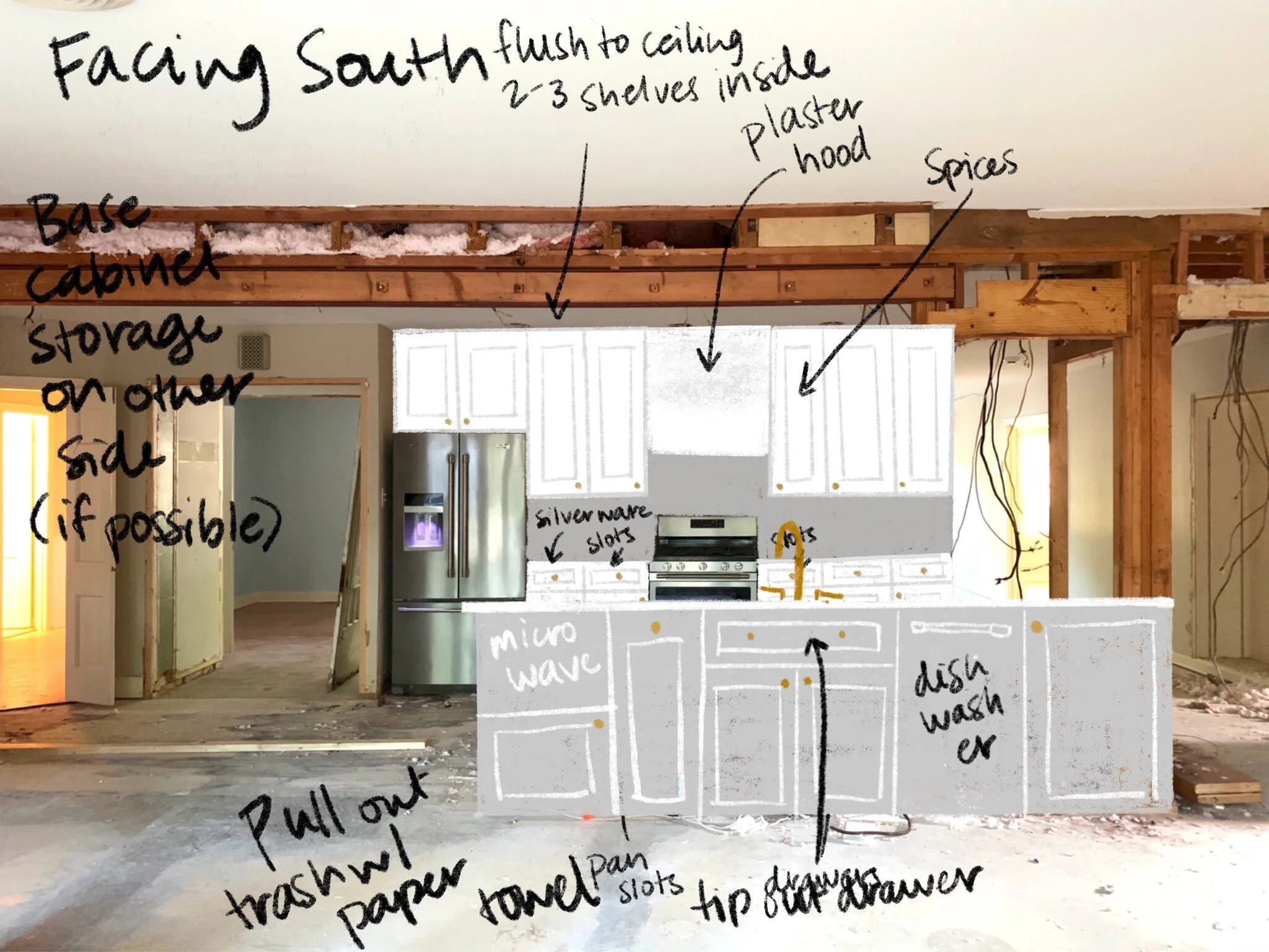
Here’s my sketch of the kitchen after demo. You can see that the beams had yet to be installed and the pantry (to the left) has been opened to make it larger- more on the pantry here!
In this sketch the kitchen island is flipped the wrong way so you can see the side that actually faces the oven. I hadn’t decided if I wanted to do a color on the island yet, or leave it white. Also, you can see I switched from knobs to pulls.
And now for the reveal!
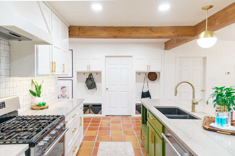
I really love how it turned out. For this project, we had to put in two beams, since the parts of the kitchen I wanted to open up were structural. I was worried that it wouldn’t be able to happen, and it would have been such a disappointment had we not been able to open it up completely- BUT our contractors got it done!
Opening up the kitchen to the hallway and the back living space made it a much more functional space for our whole family and we spend most of our time in this area.

I love, love, love my green island. Once I knew we’d be doing saltillo tile throughout this space, I wanted to counter all those orangey-reds with something complimentary but still natural feeling. This color is Relentless Olive from Sherwin Williams, and I have never identified with a paint color name more in my life. :)

The white color throughout our home is Pure White from Sherwin Williams. I have been so thankful that I chose to paint trim, walls, ceilings, and baseboards all the same color- it has made the painting process so much easier for me and everything is cohesive.

Here is a before photo of the main hallway- to the left is where the laundry room door and cubbies are now, and to the right is the kitchen and island. You can see we lost a lot of great built-ins, but the functionality and flow we gained was worth it.

Here is my design sketch for the cubbies- I eventually decided to leave the bottom section open so I could fit whatever baskets I wanted. This doorway was also previously just a wall between shelving- we created a doorway here and moved the laundry room to this area.

I love that these cubbies have storage as well as hooks for backpacks, jackets, etc. Their location in the house is really nice too, because they are an easy spot to unload as you come inside- our front door is just opposite the shelf with greenery in the photo below.

A few notes on design choices here:
This home immediately gave me a spanish/mission feel and I felt like I could make that work seeing that we are in West Texas- and so I wanted to keep the textures and tones warm and cozy without it feeling too cramped.
My mid-century loving heart also needed some gold hardware and white walls- plus some Atomic Ranch vibes. So, the globe-shaped pendants and sconces over the island and coffee bar- plus the chandelier over the coffee bar that includes globes really satisfied that for me.
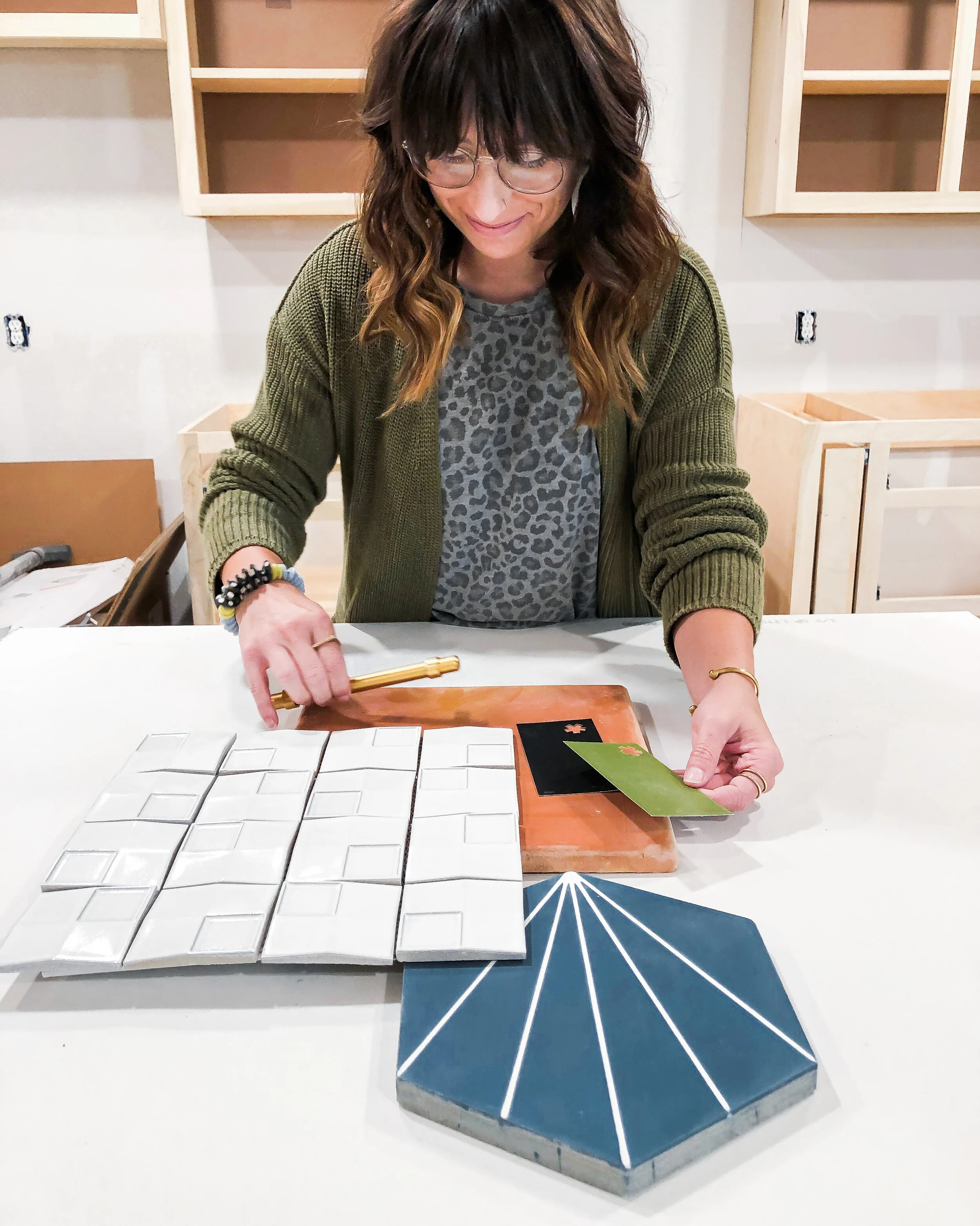
I really debated on the backsplash tile- and initially thought I would just go with white subway- but when I went to sample it, the white tones were just completely off- our paint choice being a warmer white made the subway tile look cold and hospital-like, so I kept looking. Finally- I found some interesting geometric tile on clearance at Lowe’s- and it was perfect. I would have never guessed I would go with it, but for us it has been subtle with some uniqueness- and because it is dimensional I have enjoyed the way the light plays off of it throughout the day. Unfortunately, because it was on clearance, we almost didn’t have enough to finish the job! We ran out of tile 3/4 of the way through and finally located a few more boxes in the Dallas area, where my sister picked them up and saved the day!

One of the huge perks of this home (and one of the things that convinced Shawn it was s good buy) was that all the appliances were basically brand new- like still had the warranty stickers on them new. So, we didn’t have to spend anything on appliances, with the exception of the fridge drawers and ice machine in the coffee bar. This was a huge savings for us.
I chose a black sink in the main island and the coffee bar and I have loved that choice. Not only does it hide stains well, it is super durable and I love the contrast. I’ll link everything below!
Our countertop is Macaubus Quartzite- and is probably my favorite thing in our kitchen. I knew I wanted something that had a lot of veining and movement, but marble made me nervous and quartz didn’t have the natural feel I was looking for. So, when we visited the stone yard, our friend who owns the place educated us on the different types of stones and found this slab for us. It is overall a light grey with some subtle green, blue, orange and purple tones. The green of the island really picks up the veining, which I think looks like a heartbeat line in some places. I absolutely love it.


I hope you enjoyed my tour! I’ll list links to everything I can link below!
White Paint Color: Pure White by Sherwin Williams. Our trim, cabinets and walls are all this color and it has made painting the whole house (my primary job in this reno) SO much easier!
Tile: Saltillo (terracotta) tile from Yates
Countertop: Macaubaus Quartzite purchased from Stone King in Lubbock
Contractor: Re-Purpose Construction
Everything else linked below!