Lissa Anglin • Part of Me Blog

Art, décor, family and photography- it's all part of me!

HOME + LIFESTYLE

major front porch glow up!

AnglinAbode, DIY, HOME + LIFESTYLElissa-anglin1 Comment
IMG_0286-2.jpg

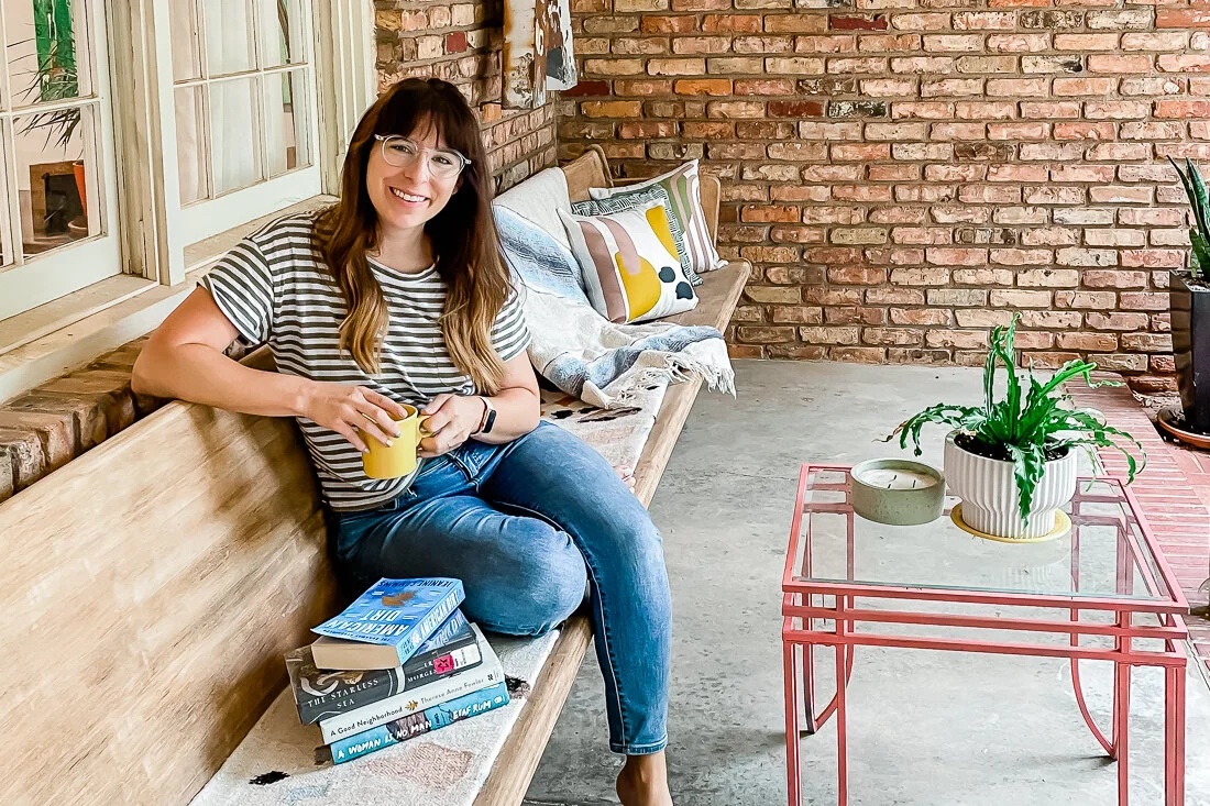
My front porch space has received basically all my love and attention since the weather’s warmed up. It’s essentially my new living room and I have loved sitting here to read, pray, and watch kids play. I’ve been wanting to cozy it up and when I realized that Cricut made pillow covers, I knew I wanted to create some custom pillows for this space.

First, let’s talk about what the patio looked like before:

2021-04-10 16.38.15 HDR.jpg

Pretty blah. The 14’ pew bench came with the house when we bought it (score!), and the metal “A” sign is one we’ve had- Shawn hung it up for me not long ago. But there was a LOT I wanted to do to this space.

First, I tackled the door. It was brown and beat up. We’d already replaced the decorative frosted glass with more modern rain glass, but I wanted to add a pop of color and change out the handle. So that’s what we did! I painted it the same color as our kitchen island- Relentless Olive from Sherwin Williams- and we switched out the gold curved handle for a more modern black one.

My favorite hint for painting any type of wood (or even faux wood)- use deglosser! Saves you hours of sanding and allows the new paint to adhere perfectly!

LissaAnglin_PartofMeBlog_0088.jpg

Once the door was done, I set my sights on the church pew. It was in ok condition- but was cracking in some spots and I suspect someone tried to stain it at some point and didn’t do a great job- it was super uneven. The easiest thing would have been to paint it, but I wanted to keep it a wood tone, so I started sanding.

You can see how the pew really needed some love here. I wanted to lighten it up so it didn’t blend in with the brick as much, so that is the reason I decided to sand!

You can see how the pew really needed some love here. I wanted to lighten it up so it didn’t blend in with the brick as much, so that is the reason I decided to sand!

2021-06-17 07.42.02.jpg

It took me a couple of days to sand all 14 feet of it, but it was worth it. Once sanded, I wiped straight-up cheap bleach on it to lighten the overall color. I ended up doing this about 3 times and it worked beautifully. My Vintage Porch has a great tutorial on this that was very helpful.

Once everything was sanded, I used some wood filler to repair some of the cracks in the wood. This is my favorite kind to use because the color changes letting you know it is dry.

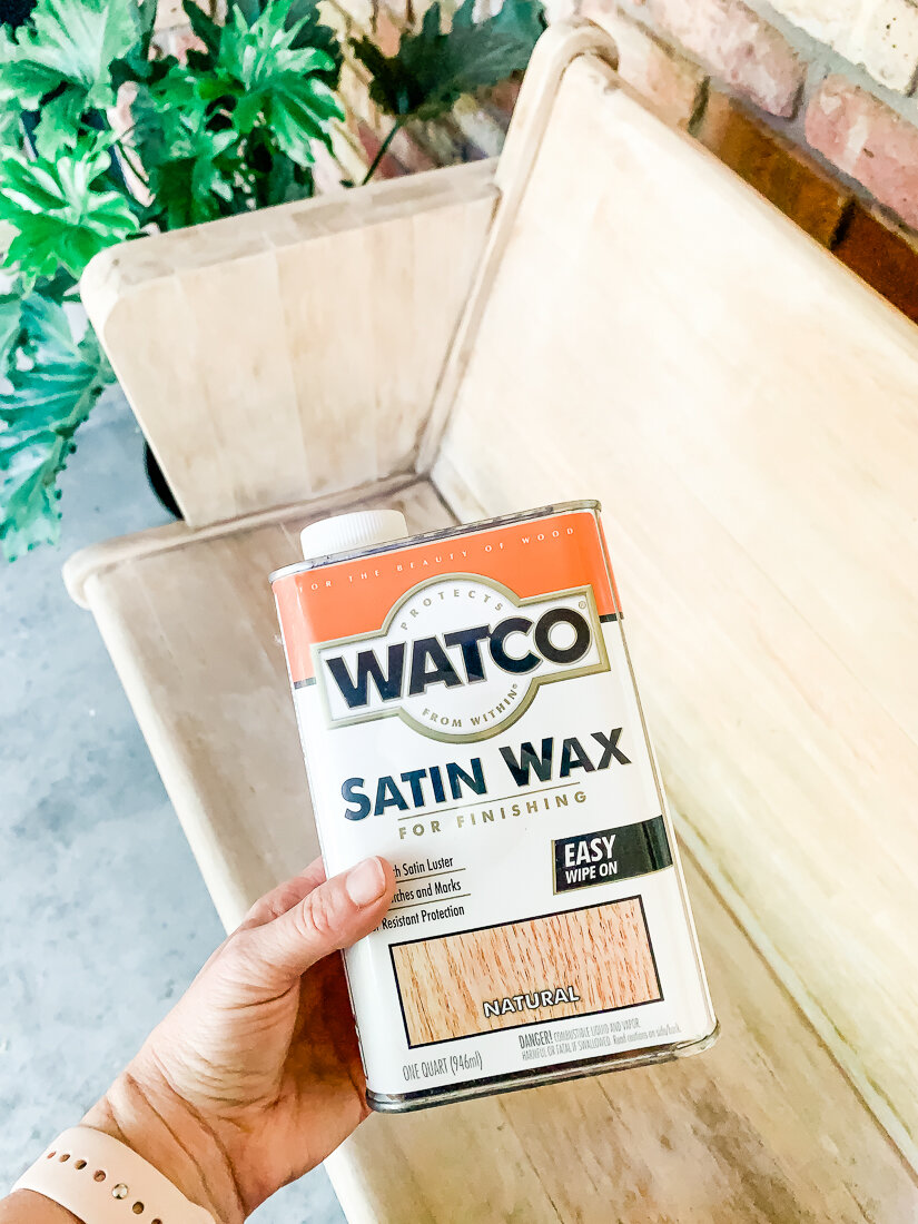
After bleaching, I coated it with Watco Satin Wax to give it a little protection. I wanted to keep the light look but also protect the wood I had just worked so hard to uncover. This did the trick! Once it went on, it did darken the wood a bit, and I panicked, but then it lightened again as it dried.

2021-06-17 09.01.03.jpg

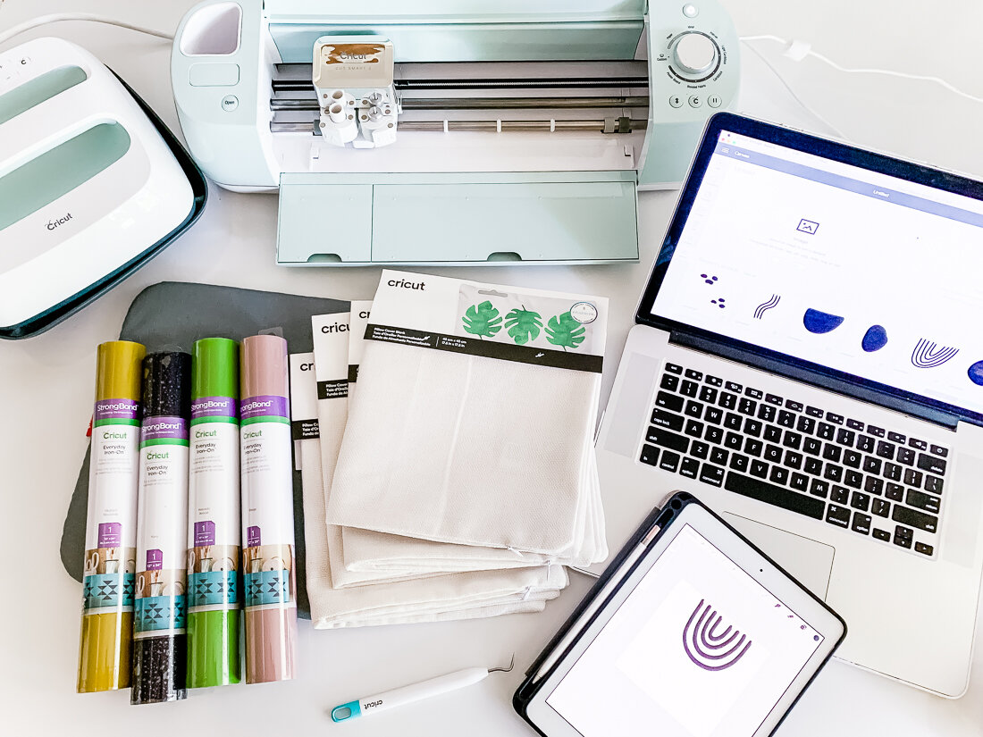
Now for the fun decorative stuff! I made the pillows using my Cricut Explore Air2 and Cricut Easy Press. Their heat press products and tools are so much fun. I ordered basically everything from Cricut and here is a list of the products I used:

Cricut Explore Air 2

Cricut Easy Press + Easy Press Mat

Cricut Everyday Iron-On (I used beige, avocado, black and mustard for these pillows)

Cricut Pillow Covers

Cricut Weeding Tools

I drew all the doodles and shapes on my iPad, then uploaded them to Cricut Design Space. From there, I made 4 different compositions for 4 pillows, and cut them on the 4 different colors. A few of my design elements were too large to be cut on my 12x12 mat, so I had to slice them and cut them in sections, then put them back together when it was time to heat press them.

I’ve uploaded my design file to the Cricut Design Space Here, and you can use it for free!

IMG_0306.jpg

Organic Shapes Collage Pillows

FREE Cricut Design Space filed linked here!

Then, it was collage time!

All my shapes are weeded and it’s time to start collaging them onto the pillow covers using my Easy Press!

All my shapes are weeded and it’s time to start collaging them onto the pillow covers using my Easy Press!

The Easy Press makes it really simple to adhere the Iron-On to the fabric. You just set your temperature and time, push the “C” button, and it times it all for you.

I adhered the bottom layer first and then added additional layers, being sure to keep all Iron-On Material covered with the transfer film (even if it was already adhered) under the Easy Press (or else it would melt!).

I was really pleased with how these turned out and love the quality of the Cricut Pillow Covers. They are perfect for my patio space.

IMG_0303-2.jpg

Lastly, I found a cute little metal coffee table (it was already pink, and I was great with that!) on Facebook Marketplace and pulled out a few pillows and a Mexican blanket I already had.

I had purchased this floor runner for our kitchen and ended up not liking it, but it worked perfectly folded hot-dog style on our bench as a pseudo-cushion! Here’s the final reveal:

IMG_0322.jpg
IMG_0327.jpg
IMG_0302.jpg

I’m so thankful for this space. I never set out to have a matching set of anything- but I do my best to buy and create things that I love- which, it turns out, kind of all go together.

It’s been a collection of little projects that make a big impact on my attitude- I love sitting here and just enjoying every little thing- and I have big intentions for the conversations, wine nights, and prayer times to be had here.

#anglinabode Kitchen Reveal

AnglinAbode, HOME, HOME + LIFESTYLElissa-anglinComment
AnglinAbodeKitchen-1323.jpg

I am SO excited to show you this before + after. This kitchen remodel was the top priority for us in this home- and the first project we tackled. I’d better show you what we were working with when we bought this home first.

The kitchen is behind this beige wall- you can see the fridge and top of the faucet from here. Unfortunately, the kitchen had already been renovated in recent years- but was just not my taste at all, and though there was an attempt to open up the space, it still felt very dark and closed in.

320822ndSt-8855.jpg
320822ndSt-8861.jpg

You can see here how the kitchen opened up into the back living space- but again, it just felt really dark and I felt it had the potential to function a lot better for our family with some reconfiguration. In the photo below, the far corner that has an air vent is where the coffee bar is now. Check out this post to see all the details on the coffee bar!

320822ndSt-8869.jpg

Here’s my sketch of the kitchen after demo. You can see that the beams had yet to be installed and the pantry (to the left) has been opened to make it larger- more on the pantry here!

In this sketch the kitchen island is flipped the wrong way so you can see the side that actually faces the oven. I hadn’t decided if I wanted to do a color on the island yet, or leave it white. Also, you can see I switched from knobs to pulls.

Untitled_Artwork 3.jpg

And now for the reveal!

I really love how it turned out. For this project, we had to put in two beams, since the parts of the kitchen I wanted to open up were structural. I was worried that it wouldn’t be able to happen, and it would have been such a disappointment had we not been able to open it up completely- BUT our contractors got it done!

Opening up the kitchen to the hallway and the back living space made it a much more functional space for our whole family and we spend most of our time in this area.

AnglinAbodeKitchen-1081.jpg

I love, love, love my green island. Once I knew we’d be doing saltillo tile throughout this space, I wanted to counter all those orangey-reds with something complimentary but still natural feeling. This color is Relentless Olive from Sherwin Williams, and I have never identified with a paint color name more in my life. :)

AnglinAbodeKitchen-1115.jpg

The white color throughout our home is Pure White from Sherwin Williams. I have been so thankful that I chose to paint trim, walls, ceilings, and baseboards all the same color- it has made the painting process so much easier for me and everything is cohesive.

AnglinAbodeKitchen-1139.jpg

Here is a before photo of the main hallway- to the left is where the laundry room door and cubbies are now, and to the right is the kitchen and island. You can see we lost a lot of great built-ins, but the functionality and flow we gained was worth it.

320822ndSt-8845.jpg

Here is my design sketch for the cubbies- I eventually decided to leave the bottom section open so I could fit whatever baskets I wanted. This doorway was also previously just a wall between shelving- we created a doorway here and moved the laundry room to this area.

Untitled_Artwork.jpg

I love that these cubbies have storage as well as hooks for backpacks, jackets, etc. Their location in the house is really nice too, because they are an easy spot to unload as you come inside- our front door is just opposite the shelf with greenery in the photo below.

AnglinAbodeKitchen-1167.jpg

A few notes on design choices here:

  • This home immediately gave me a spanish/mission feel and I felt like I could make that work seeing that we are in West Texas- and so I wanted to keep the textures and tones warm and cozy without it feeling too cramped.

  • My mid-century loving heart also needed some gold hardware and white walls- plus some Atomic Ranch vibes. So, the globe-shaped pendants and sconces over the island and coffee bar- plus the chandelier over the coffee bar that includes globes really satisfied that for me.

  • I really debated on the backsplash tile- and initially thought I would just go with white subway- but when I went to sample it, the white tones were just completely off- our paint choice being a warmer white made the subway tile look cold and hospital-like, so I kept looking. Finally- I found some interesting geometric tile on clearance at Lowe’s- and it was perfect. I would have never guessed I would go with it, but for us it has been subtle with some uniqueness- and because it is dimensional I have enjoyed the way the light plays off of it throughout the day. Unfortunately, because it was on clearance, we almost didn’t have enough to finish the job! We ran out of tile 3/4 of the way through and finally located a few more boxes in the Dallas area, where my sister picked them up and saved the day!

CoffeeBar-6026.jpg
AnglinAbodeKitchen-1351.jpg
  • One of the huge perks of this home (and one of the things that convinced Shawn it was s good buy) was that all the appliances were basically brand new- like still had the warranty stickers on them new. So, we didn’t have to spend anything on appliances, with the exception of the fridge drawers and ice machine in the coffee bar. This was a huge savings for us.

  • I chose a black sink in the main island and the coffee bar and I have loved that choice. Not only does it hide stains well, it is super durable and I love the contrast. I’ll link everything below!

  • Our countertop is Macaubus Quartzite- and is probably my favorite thing in our kitchen. I knew I wanted something that had a lot of veining and movement, but marble made me nervous and quartz didn’t have the natural feel I was looking for. So, when we visited the stone yard, our friend who owns the place educated us on the different types of stones and found this slab for us. It is overall a light grey with some subtle green, blue, orange and purple tones. The green of the island really picks up the veining, which I think looks like a heartbeat line in some places. I absolutely love it.

AnglinAbodeKitchen-1231.jpg
AnglinAbodeKitchen-1267.jpg
AnglinAbodeKitchen-1158.jpg

I hope you enjoyed my tour! I’ll list links to everything I can link below!

White Paint Color: Pure White by Sherwin Williams. Our trim, cabinets and walls are all this color and it has made painting the whole house (my primary job in this reno) SO much easier!

Tile: Saltillo (terracotta) tile from Yates

Countertop: Macaubaus Quartzite purchased from Stone King in Lubbock

Contractor: Re-Purpose Construction

Everything else linked below!

#anglinabode coffee bar before + after

HOME, HOME + LIFESTYLE, DIYlissa-anglin1 Comment
CoffeeBar-5814-Edit.jpg

So excited to finally share one of my favorite spots in our new home- the coffee bar! This space used to be a blank, open corner- and I knew immediately upon walking in the house that there needed to be something there to draw you in. Here’s the before:

320822ndSt-8871.jpg

Soooo much blah. There were several issues here we had to deal with:

  • The weirdo uplights that are along the walls above the doors and windows. We removed those ASAP.

  • The french doors (open in the above image) that led to the master bedroom. I have nothing against french doors, but I did not want them leading to my bedroom off the main living space- especially when my son has friends over (yikes!)- so we closed in this opening a bit and made it a regular door.

  • The thermostat had to be moved.

  • The AC vent was an issue- because I wanted to do lower cabinets there. I am pretty proud of our solution!

  • Sooooo much electrical work had to happen. Light switches and outlets needed to be moved, and I added sconces, under cabinet lights, pot lights and a chandelier. Because this room was originally a porch, there is NO attic space so installing all of this was a real task I’m thankful our contractors were up for.

320822ndSt-8845.jpg

The original view from the main hallway. Unfortunately, all of these shelves are now gone, but it’s for the better, I promise! You can see how this corner is visible at the end of the hall.

Here is my Coffee Bar Inspo:

Coffee Bar by Lissa Anglin

Here is the area mid-construction. This home has been renovated at least 2 times before this one- you could see all the layers and modifications once the walls were peeled back. Poor old house- I hope we will do her justice and make this the last renovation.

IMG_4651.JPG

Annnnnnnd here’s how it turned out!

CoffeeBar-5981.jpg
CoffeeBar-5989.jpg
CoffeeBar-6052.jpg

I’d originally thought about doing green cabinetry (Relentless Olive by Sherwin Williams, which is on our kitchen island), but chose to keep it white (Pure White by Sherwin Williams) so that this potentially dark corner stayed as light and bright as possible.

It was important to me to have a large decorative element (the open shelving) to draw you into the space from the front door. This corner is the perfect landing space for everyone, and it perfectly accommodates a solo cup of coffee or a bunch of rowdy kids!

One day, I’d love to find a tulip table to put in place of my vintage black one here, but for now this table is serving us well!

I mentioned the issue of re-routing the AC vent earlier, and the solution was to create a vent on the side of the bottom cabinets (see that gold box? It’s actually a vent!). We also created a new vent (also housed inside the lower cabinets) into our bedroom on the other side of this wall to keep the air flowing. Amazingly, we still have quite a bit of storage in those cabinets.

When I shared this corner on Instagram, many people thought this was actually my kitchen space- and it sort of is! It is open to the kitchen, so it feels like an extension of the kitchen, really.

This little corner packs quite a bit in to keep it super functional for our family. I didn’t want to have to walk all the way across the room just to throw away old coffee grinds or to fill up the pot. It includes:

  • pull out trash can

  • double drawer fridge

  • nugget ice maker

  • RO system

  • small sink

CoffeeBar-6058.jpg

This little area of our home is where I splurged the most. Having the extra drink space and “Sonic ice” has really made working from home enjoyable- and I also love the fact that everything is accessible for the kids.

CoffeeBar-6010.jpg

Another thing I was very intentional about was the black quartz sink. Knowing that there would be a LOT of coffee in this sink, I wanted to avoid having to bleach it often, and the black sink has been so wonderful for that!

Here’s a “lights on” image- we put the sconces, chandelier and pot lights on all different switches and have really enjoyed the ability to adjust the lighting to the time of day/mood. The bulbs inside the sconces are actually grow lights and I keep them on all day so that my planties get the sun they need.

CoffeeBar-5669-Edit.jpg

For the glass in the upper cabinet, I chose rain glass. I’m not into the frosted look, but I also wanted a little diffusion on it. I really love the way it turned out!

I’m going to do my best to link everything pictured here:

White Paint Color: Pure White by Sherwin Williams. Our trim, cabinets and walls are all this color and it has made painting the whole house (my primary job in this reno) SO much easier!

Tile: Saltillo (terracotta) tile from Yates

Countertop: Macaubaus Quartzite purchased from Stone King in Lubbock

Contractor: Re-Purpose Construction

Chandelier (I really wanted this one from West Elm, but it was just plain out of budget. In the end, I’m really happy with the one we have and think it is a more appropriate size for the space anyway).

Sconces (these were surprisingly affordable!)

Knobs

Sink

Faucet

Drawer Fridge

Ice Maker

Grow light bulbs (for keeping my plants alive! I put these in the sconces)

Backsplash tile was a clearance find and we almost didn’t have enough to finish the job because it was disappearing from stores so quickly! Thankful my sister picked some up for us in the DFW area so we wouldn’t have a half- finished wall.

Just in case any of you are coffee fanatics like us, here are our coffee makers:

Coffee Pot

Espresso Machine

Coffee Grinder

So, let me know what you think! We are loving our coffee corner and I have so much more to share with you soon!

This post contains affiliate links, on which I will receive a small commission should you purchase anything/sign up/subscribe etc. I would never share something I didn’t actually like or want to share with you, so I wanted to let you know. Sharing affiliate links affords me a few more lattes and it’s always my aim to add value to your life with the brands and products I share. Thanks for supporting me!

#anglinabode kitchen + coffee bar inspo

HOME + LIFESTYLElissa-anglinComment
IMG_5601.JPG

SO EXCITED to share my vision for the #AnglinAbode kitchen and coffee bar area. First things first- our home is a Chicago brick home built in 1942, which I actually like- there are a lot of warm oranges- and that plus the xeriscaped front yard has always given me a southwest/desert vibe.

For the past several years, I have embraced more of my Texan roots and incorporated desert-style decor into our home. That, coupled with a visit to the Southern California desert earlier this year made me really want to lean into the Modern Desert feel with this home.

Of course, my mid-century-loving heart is still very much alive and so you can expect this home to have a little bit of everything- we can call it Mid-Mod Desert Eclectic. :)

Since we’ve gutted the kitchen and removed some walls, we decided to also put in a coffee bar into one corner of this open-concept space. Here’s what the kitchen is looking like so far:

Kitchen Inspo by Lissa Anglin

I grew up in a home that had saltillo (or terracotta) tile, and when we walked through this house, that idea just fit and the tile is very budget-friendly for the large space we are needing to cover.

Links:

Saltillo Tile (we purchased this locally)

Black Quartz Composite Double Sink

Gold Kitchen Faucet

Gold Bar Pulls

California Dream Quartzite (purchased through Stone Crown locally)

Globe Pendant Lights

Paint Colors:

Sherwin Williams Pure White

Sherwin Williams Relentless Olive

We are planning to do shaker-style cabinets in Sherwin Williams Pure White with gold bar pulls. I liked the detail on these pulls and they are nice and heavy feeling. The island we will paint Relentless Olive- I saw this green and read the name…and I just knew we had to use it. I think it will be a great way to balance the red-orange of the floor.

Very, very excited about the black sinks we have purchased- my parents renovated and installed black sinks and I loved the durability and the fact that they will hide stains well. We are including a smaller sink in the coffee bar, and I am so excited knowing that I won’t be bleaching out coffee stains constantly.

The pendant lights were the big splurge in the kitchen, and I’m glad I went for the ones I really wanted. They are a slightly lighter gold than the rest of the fixtures I have purchased, but my mom and I have a plan to remedy that soon.

Lastly, let’s talk countertops. We made a trip out to Stone Crown here in Lubbock which is owned by our friend Scott, and he educated us on the differences between granite, quartz, and quartzite. We went in thinking we’d be doing quartz, which is a man-made product, and extremely consistent in look and durable because of that. Granite was a no-go for me- just wasn’t the look I wanted, and quartzite I had never heard of. Scott told us that essentially, quartzite is a natural product so it has the organic colors and lines I was looking for, plus it is extremely durable. Previously it has been a very expensive product, but in recent years the cost has become comparable to quartz- and Scott was able to find us a slab that was in our budget and just beautiful. The color is called “California Dream” and it is a light grey with some interesting subtle green veins, which I think will pick up the island paint color nicely.

Ok, on to the coffee bar!

Coffee Bar by Lissa Anglin

Links:

Sconces

Chandelier

This was a compromise for me. I had ooohed and aaahed over this West Elm one, but could not justify the price. In the end, I found this one and I think I actually like it better! The straight (not-angled) bars on this chandelier create a more peaceful feeling than the West Elm (more sputnik) one, and we need all the peaceful feelings we can get in our home. I’m so glad I went with the one I did.

Black Quartz Composite Sink

Gold Faucet

Ice Maker

Guys, I cannot in good conscience tell you to purchase this ice maker from Amazon, which is what I linked here. We purchased it originally on Amazon and I’m not kidding- we had to return it 3 (yes, THREE) times because there was damage to the machine. So, we ended up finding one at a store a couple of hours away and picking it up to ensure there was no shipping damage. UGH.

Refrigerator Drawers

The ice maker and fridge drawers are the most bougie purchases we have made so far, but I do believe they will make this little area one of the most popular spots in our home! With 3 kids, I’m excited to have a place to put drinks for them that they can access themselves.

I also plan to paint all of the coffee bar cabinets Relentless Olive green. Since it is a separate space from the main kitchen area, and I want it to be a bit more cozy, I am hoping the color will add interest and an intimate feeling.

Hope you enjoyed my little inspo tour! There’s a lot more on my Pinterest board if you want to follow me there!

Check out my #AnglinAbode Kitchen + Coffee Bar Pinterest Board!

initial design sketches for the Anglin Abode

AnglinAbode, HOME, HOME + LIFESTYLElissa-anglinComment

I’m excited to share my initial design sketches with you for the #anglinabode! These are the initial sketches I handed our contractor. I literally just drew them up over the listing photos and was like, “can you make this happen?!”. Haha, thankfully they have been great to work with and listened to all of my design concerns.

I mentioned in my first post about our new home that the first time we walked through it I was like


But then once I went home and had some time to really think about the layout, what I liked and hated about the house, a vision began to grow.

I started sketching and got really excited about the potential. Of course, everything was riding on the idea that we could renovate. Once I had a vision for the property, I couldn’t picture it working out for our family without the changes- and without the changes, I wasn’t interested in buying the home. So the reno was key. It had to happen.


Prepare yourselves, I’m feeling very GIFy today.

After talking it over with Shawn, we decided we’d want to re-do the kitchen and main living space, create a new laundry room, and re-do all the bathrooms. So yeah, pretty much the whole house- not to mention some exterior changes we’d like to make.

We decided to start with the kitchen, main living, and flooring and MOVE IN WITH MY PARENTS until those were done. Ya’ll, my parents might be the most patient and gracious people I know. We’ve been living with them for about a month now and I know they have earned some extra crowns in Heaven these past few weeks. :)


Let’s walk through some of the pain points and potential solutions:


LissaAnglin_PartofMeBlog_0077.jpg

Problem: SO MANY different types of flooring. There were original hardwoods in some of the rooms, carpet in others, and laminate flooring. Having so many different flooring types is a pet peeve of mine- and I don’t like carpet, either. In our last home, we ripped up all the carpet and installed laminate which made a huge difference.

Solution: Tile and refinishing the original hardwood, putting in new hardwood. Since I’m not a fan of carpet (rugs allll the way for me! Washable, replaceable, and hard flooring lasts way longer), I decided to do tile in the main entry hallway and kitchen/main living area, along with the new laundry room. 2 of the 4 bedrooms did not have the original hardwoods that the others did, so we planned to install matching hardwoods there. Flooring consistency achieved.

320822ndSt-8861.jpg

Problem: Kitchen was too closed off. The kitchen in this home had undergone a renovation not too many years ago, but it just wasn’t our style, and I didn’t feel it would function very well for us the way it was. Originally it must have been a closed in room, but had been opened up a bit to create a u-shaped layout with a bar. It wasn’t bad, but I really wanted to see it with a standalone island. So, I drew up this sketch:

IMG_0516.JPG
IMG_0517.JPG

Solution: Knock those walls down and create a 1-wall kitchen with an island. Here, we are getting rid of the wall that connects to the main hallway, and converting the current bar area into an island. This part of my plan was the thing I was most nervous about- we wouldn’t know whether this wall was load-bearing (which it likely was) until after we purchased the home. If it was, a beam would have to be put in and could be a large budget item.

I was pretty adamant on making the walls disappear so that the overall space would be a lot more functional and inviting for us, as we’d have more seating around a bar and the flow of the kitchen would work better. As it was, there was only room for 2 people, and 1 way in and out of the space.

Here’s a more updated sketch of the kitchen- in this sketch the island is flipped around so you can see the appliances- the side that is showing will actually be facing the kitchen wall. I’ve already changed my mind on a couple of things, so there will be tweaks.

IMG_0519.JPG
You can see the pantry here to the left of the fridge.

You can see the pantry here to the left of the fridge.

Problem: TINY pantry. Yall, this pantry space was wide, but only about 6 inches deep. It was laughable. There was NO way our family of 5 could contain all our snacks in there.

You can see the pantry already opened up to the closet behind it in this image.

You can see the pantry already opened up to the closet behind it in this image.

Solution: Open up the pantry to include the closet from the front room. The pantry solution was wonderfully easy- there was a closet right behind it that opened into the front living room. We decided to close it up and use that space to make the pantry larger. Yay!

The laundry room is located through the right door in this photo.

The laundry room is located through the right door in this photo.

Current laundry situation. That’s our Christmas tree, not a body bag, haha.

Current laundry situation. That’s our Christmas tree, not a body bag, haha.

Problem: Laundry area was inefficient. Ya’ll, I don’t love laundry, but I especially don’t love laundry if I feel like I am in exile while doing it. The placement of the laundry room had been moved a couple of times, it seemed, as this home has been added onto (we can count at least 3 renovations this poor home has already endured!), and currently, the laundry room was off the master bedroom. It had an exterior door- why? Who knows. No storage. Behind that door is the water heater. And to get to it, you have to go through the master bedroom. Plus, it took up space. If we moved it, we could DOUBLE the size of our master bathroom. Yes, please!

Current sitting area off the master- future laundry room!

Current sitting area off the master- future laundry room!

The other side of the new laundry room. This bookshelf will be made into a doorway that opens to the main hallway, so now you don’t have to go through the master to get there.

The other side of the new laundry room. This bookshelf will be made into a doorway that opens to the main hallway, so now you don’t have to go through the master to get there.

Solution: Move the laundry room. Am I crazy? Yes. Right off of the master bedroom, there was a little sitting area. Initially I imagined using it as space for a vanity or comfy chair- but then I realized it would be a perfect laundry room. If we were able to open it up to the hallway, it would be easily accessible but wouldn’t require a trip through my bedroom. And, it would be more centralized in the home. Plus, I’d be able to add storage and a sink. Having a sink in my laundry room is something I have always looked for- since I do so much painting and other creative projects, I like having a sink to wash out brushes, etc. that isn’t the same sink I do dishes in. A caveat to this is that our master closet is connected to this room, but not our master bedroom, so we’d have to also have a door to our master bedroom. I am excited about this, however, because I think it will actually make doing laundry easier since our closet is right off the laundry!

This area of our house which I am calling the main living area is actually an old patio that was enclosed. Because of that, there is no attic space here nor overhead lighting.

This area of our house which I am calling the main living area is actually an old patio that was enclosed. Because of that, there is no attic space here nor overhead lighting.

The old owners installed these very interesting light fixtures (you can see them over the windows and the door) that I couldn’t wait to see go. I also felt this back corner really needed something to define the space.

The old owners installed these very interesting light fixtures (you can see them over the windows and the door) that I couldn’t wait to see go. I also felt this back corner really needed something to define the space.

Problem: Lots of space with no function. I love a well-designed home, and if you don’t know by now, I care A LOT about the function of the home, as well as the visual style. So, in envisioning our main living area, I saw a lot of space without a lot of function. It was missing overhead lighting, and I wasn’t sure what the furniture configuration would look like.

IMG_0520.JPG

Solution: Add cabinets to create storage and define the space. Because we were losing some cabinet space when we opened up the kitchen, I thought it would be fun to add some cabinetry to the back corner of this main room. You see this corner upon entering the home, and it would help designate a dining space for the room. So our “beverage bar” was born! My sketch here includes L-shaped cabinets, open shelving, outlets for coffee makers, etc. and a small sink. We also got a little bougie and included a nugget ice maker and refrigerator drawers for sodas, beer, etc. I am really excited about this little area and hope it becomes an easy entertaining space for us and our kids. I plan to put our dining table in this corner.

320822ndSt-8845.jpg

Problem: No mudroom/inefficient shelving. When we first toured the home, I loved the built in shelving that was at the end of the main hallway. However, I didn’t love it as much as I loved the concept of a more open kitchen. In order to open up the kitchen we had to lose the shelves on the right side. The other side of shelving had one bookcase-style shelf, and one magazine-rack style shelf. I am sure I could have come up with a creative solution for those magazine racks- but I really wanted them to be more useful.

IMG_0521.JPG

Solution: Make them into storage/Mudroom type shelves! I designed 2 symmetrical areas on either side of the new laundry room door. They will have an enclosed cabinet up top, hooks in the middle, and cubbies for shoes in the bottom. So excited to see these come together!

320822ndSt-8875.jpg

Problem: Ugly fireplace area. I loved the storage, shelving, and fireplace here, just not really anything else. The fireplace insert is not one I would have chosen, nor is the mantle or cabinetry style. So, this area is going to get some cosmetic touch ups.

IMG_0515.JPG

Solution: Lengthen the mantle and reconfigure the shelves. I love a good mid-century mantle, so I have a 10’ one planned for this space. I am hoping to adjust the middle shelving unit so that I can put a TV over the middle and still get to decorate over the fireplace.

There are lots of other little changes happening within these BIG changes, so I’m hoping to do some close-ups on them as they get completed. Tell me- what do you think of my plans? Which solution is your favorite? I can’t wait to see this home look cohesive, beautiful, and functional.


I’ll take the mid-century goodness without the housewifey-ness, please!

Lissa's Lists • Spring + Summer Home Refresh

HOME + LIFESTYLE, WISHLISTS, Lissa's Listslissa-anglin2 Comments

Since we’re all spending a lot more time at home lately, I have found myself in spring cleaning mode. We’ve purged, rearranged, consolidated…and now I’m excited for a little refresh because the weather had been beautiful lately!

So, for today’s Lissa’s List, I’m sharing a few things I’ve picked up for my home, and a few things I’ve loved having over the years.

Funny Doormat
I saw this a few weeks ago and thought THAT WAS MADE FOR OUR HOUSE. This Etsy shop offers lots of hilarious and cute sayings on custom made doormats.

Under Doormat Rug
I just love this buffalo check and it’s the perfect for under a natural fiber doormat. Comes in red and black for all you Red Raiders, too!

Olive Leaf Door Wreath
I am so impressed with this little faux olive wreath - I’m picky about faux flowers, and this leafy wreath is just perfect for my front door.

Faux Plants


Wall Hanging Faux Plants
I hope to be a real plant lady one day, but these faux hanging plants are just perfect. I think I’m going to grab a few for the kids’ bathroom.


Faux Fiddle Leaf Fig Tree
I have a couple real fiddle leaf fig trees, and let me tell you- they are finicky. Thankfully, you can’t kill this one and it looks quite nice in any corner of your home.

Faux Snake Plant
I’m also snagging some of these for my front porch on either side of my front door. They add the perfect amout of height.

Santal Oil
Ya’ll, if you grab ONE thing off this list, make it this oil! It is absolutely my favorite smell and we keep it in our living room diffuser pretty much all the time.

Outdoor Rug
I get asked about this rug all the time. It is actually an outdoor rug, but I have it under our dining room table because KIDS ARE MESSY. I love that I can literally wipe or spray this off. We’ve had it a few years and it still looks brand new.

Outdoor Pillows
Neutral
Love these neutral pillow covers with the leather accent. I would definitely use these inside, too!
Colorful
These are very similar to what I currently have on our patio, and I love the bright colors and illustrations.

Utensil Caddy
My mom has always kept a caddy like this stocked with paper goods in her pantry, and finally last year I bought one and wondered why I hadn’t done it sooner! This caddy is perfect for stocking with paper plates, napkins, and utensils and makes grilling out and eating on the patio super easy.

Wooden Utensils
I love these and think they are a stylish and Earth-friendly alternative to the plastic utensils. Plus, they aren’t that expensive! I’ve got some in my cart.

Diamond Planter
I’ve been eyeballing this planter on Amazon for a while now! So cute!

Planter with Stand
I have this planter and get asked about it a lot. Neutral and stylish.

Fiddle Leaf Woven Basket
Excited to have gotten one of these as a new home for one of my fiddle leaf figs. I almost bought another one for throw pillows and blankets in the living area.

Paper Goods

While looking for a caddy similar to mine, I came across all these fun paper goods and had to share! What a fun way to make a backyard dinner a little more special!
Amethyst & Rose Gold Paper Plates

Pale Pink & Gold Confetti Paper Cups

White Marble & Gold Cocktail Paper Napkins

Gallery Wall Update

HOME, HOME + LIFESTYLE, CRAFTS, DIYlissa-anglinComment

Lucy has been home for almost 2 YEARS now- and guess which professional photographer has ZERO framed prints of her newest daughter in her home?! Yep. This one. What’s the saying? The cobbler’s children have no shoes? It’s like that at our house, unfortunately.

Realizing the great need for her sweet face to adorn our walls, I was also feeling all cluttered and anxious about the current state of our living room/dining room gallery wall:

IMG_2017 2.JPG

Yes, that is the infamous man lamp. He’s been in the family for years, and he has now relocated to my desk.

Anyway, it was high time for a change. I wanted a simpler gallery wall look and imagined large frames with large white mats. So, my first step was calling up my friend Lauren for some new family photos. Lauren did her MAGIC (seriously, she is magic) in about 10 minutes and the kids were rewarded with giant chocolate bars. I love the photos from this session so much, I’ll have to share them in another post.


If you’d rather watch the video version of this post, feel free to scroll on down!


After measuring the wall and deciding how large I wanted my frames to be, I did a little mock up in Photoshop. I knew I wanted an oversized, floor-to-ceiling look, so I measured the wall and did the maximum size I could.

Wouldn’t that completely cover the wall again?! Yes, but the reason this works from a design standpoint is because the large mats and skinny frames don’t require a lot of visual space.

Tip: If you are wanting to recreate this look, it’s very important that you measure your wall space, and use skinny frames close together (mine were 2 inches apart) with large neutral colored mats.

GalleryWallMockUpweb.jpg

I originally thought I would do black and white, but that was vetoed by everyone else in the family, and also thought I could fit 8 frames in instead of 6…math was never my forte. It did help me plan and visualize, though!

After a LOT of shopping around, I ended up with these frames from Michael’s. They are technically poster frames, which makes them less expensive, and have plastic instead of glass.

When I first hung up the frames, I was a bit disappointed that you could see the slight bending of the plastic when the light glared on them (revealing that they aren’t truly glass)- this is a little thing that my perfectionist self wanted to fix immediately- but after thinking a bit, the plastic is really a better choice for our family right now- especially since these frames sit lower to the ground.

GalleryWall-5225.jpg

You can see the bending glare a bit in the above photos.

I ordered these prints from Sam’s Club, of all places! They were having a sale and though I typically recommend mpix.com, I thought it was cheap enough to give it a shot. In the end, I was pretty happy with the way they turned out. I was able to pick them up in 24 hours. They were delivered rolled up, so I flattened them out and put them under a weighted piece of artboard for a couple of days to make them easier to frame.

My frames are 24x36'“, and I ordered 16x20” prints. I thought I would just order custom mats for the frames, since that is an irregular mat size, but Michael’s was going to charge me $38.00 per frame! So, I was super excited when I found FrameItEasy.com. I was able to order exactly what I needed for around $10 per mat.

Click here to get 10% off your order at FrameitEasy.com!

(affiliate link)

The mats fit perfectly and were great quality. I also love that they do framing, and will probably be ordering all-out framed prints from them next time.

I used regular ‘ol masking tape to tape the prints to the back of the mats. I realize this is a no-no in the photography world, as it’s not archival quality and the chemicals in the tape will cause the prints to break down over time, yada, yada, yada….but let’s be real, I’m going to change these prints again before anything like that starts happening.

Once it was time to hang, I began with the center two prints and worked outward, using a level to make sure the lines were all straight. I’m not going to lie- these frames are a total pain to hang with the tiny sawtooth hanger (I MUCH prefer wire across the back), but you only have to do it once. :)

Tip: Even after I had then all hung, they still tilted a bit one way or the other, so I attached velcro command strips to the backs of the frames and onto the walls, which keeps them straight (and in place when a kid decides to ram into one- we have a rambunctious crew, ya’ll).

In the end, I was super pleased with how it turned out! The frames are semi-obstructed by the couch in our living room, but all visible from the dining/kitchen area.

GalleryWall-5268.jpg

Watch below for a few more details on the process. I hope this was helpful!

watercolor poppies bible journaling tutorial

HOME + LIFESTYLE, DIY, CRAFTSlissa-anglinComment
poppypagetitle.jpg

Hey friends! Since I’ve received my new Illustrating Bible, I have had the best time working in it! It has much larger space to create and I looooove the spiral binding and square shape. I’ve also found that the pages themselves are a bit thicker than other journaling Bibles I’ve had, which is great because I love to use watercolor, and it tends to bleed through.

One of the first pages I created was this poppy scheme in Song of Songs 2 and I’ve had so many requests to do a tutorial on it I thought I’d give it a shot.

IMG_4524.JPG

So, I set out to create a light pink version of this same concept, and I filmed the process so you can follow along!

poppypage.jpg

I have to apologize for the shaking camera and random interruptions- it’s summertime and my son was wanting to paint with me, so I wasn’t about to say no! I’ll post the links to everything I used at the end of this post.

Affiliate Links:

Illustrated Faith Bible Tabs: http://www.kqzyfj.com/click-9062253-1

Illustrating Bible: https://www.kqzyfj.com/click-9062253-13446143

Holbein Watercolors: https://amzn.to/2LoCCNx

Watercolor Tin: https://amzn.to/2DJJMWj

Round Brushes: https://amzn.to/2V0aqQH

Illustrated Faith Hexagon Stickers: https://amzn.to/2Ww7ssQ

DaySpring Blank Shape Stickers: https://amzn.to/2K6SSl0


So, let me know- did you enjoy this post? Was it helpful? What more would you like to see? Thanks for tuning in!

Customizing Bible Tabs with Watercolor and Gold Leaf

HOME + LIFESTYLE, CRAFTS, DIYlissa-anglinComment
IMG_4589.jpg
IMG_4603.jpg

I really hesitate to use the word “bling” in any circumstance…but honestly that is the best word I can think of to describe what this project is all about. :)

I got in my new Illustrating Bible from Dayspring and you guys, I’m OBSESSED. I want to paint in it all. the. time. I reviewed in on my InstaStories but if you haven’t seen it yet- it’s amazing. Spiral binding, huge margins for note-taking, painting, coloring- thicker pages which means I don’t need to prep them before I watercolor. It’s really amazing.

You can pre-order the new Illustrating Bible here- it will ship out May 15!

One of the first things I knew I wanted to do was make some tabs for it. I loved using the tabs on my last journaling Bible and knew it would make my Bible so much more “me”. So, I was really excited when I saw that Dayspring also had these Bible tabs that would be perfect for customizing. I ordered them and a few other Illustrated Faith accessories.

I love working in watercolor and on a whim I decided to throw in some gold leaf just to make it extra special. I have to say I am really pleased with the outcome and love that there is a burst of color from every angle of my Bible now!

I videoed the whole process, and if you’d like to make some of your own, this will show you exactly how to do it!

MATERIALS NEEDED:

Illustrated Faith Bible Tabs

Illustrating Bible

Holbein Watercolors

Watercolor Tin

Round Brushes

Gold Foil

Mod Podge

I would love to see what you create! Connect with me on Instagram @lissaanglin.

The Illustrating Bible was given to me by Dayspring to review and this post is my honest opinion. This post contains affiliate links that help me continue to bring fun content to this space, so if you like what you see, I’d love for you to use my links!

Easy Easter Baskets

HOME + LIFESTYLElissa-anglinComment
EasterBaskets-4413.jpg

I’m definitely an Amazon Prime type of mom, and that includes Easter basket goodies. I love filling the kids’ baskets with a few fun (and functional items), a little candy, and lots of things we ‘ll be able to use over and over. So, I’m sharing my Easter Baskets Amazon List today- just in case you’re in need of some new ideas- just click Add To Cart and you’re DONE!

Click on any item below and it will take you straight to Amazon- easy peasy!

I love giving my kids the fun stuff, but I’m also practical and take every opportunity I have to throw in some practical items. This includes a few different categories of items:

Outdoor items: sidewalk chalk, and bubbles (this Fubbles bubble holder is a NO-SPILL container- I don’t know about you, but we have spilled many brand-new bottles of bubbles).

Artsy-crafty things that double for use in the car: I love the Melissa and Doug products like Scissor Skills, Scratch Art, and Bingo Markers are all entertaining and portable. We also LOVE Monkey String (also called Wikki Stix) and I keep a package of it in my purse, my car, and the girls’ backpacks (really) because it is a great non-messy activity to have at restaurants and other places kids may be waiting. Model Magic is not for the car, but an easy-to-clean alternative to play dough that dries and can be displayed.

Bath items: I’m dying to try out these water flutes and bath bombs with fun surprises inside are always a hit!

Books that are also great in the car: I spy books for different ages, and a book on coding for our son who is the best kind of nerd. :)

A little Candy: White Rabbit candy can be found in China and so I thought it would be a special edition this year. We always need chocolate carrots and I KNOW the kids will think the Bunny Farts are hilarious.

Games: This colorful Jenga set is too cute, and Knox has recently had an obsession with Uno. I know he will love this emoji edition! Also- how genius is this $5 card holder for kids?!

Practical: We love these silicone shoelaces. They make any shoe a slip-on and are so convenient! The Contigo brand cups are also a favorite and the ONLY kind that we have found that do not leak. I like to buy a few every now and then to keep our collection fresh.

I hope you’ve found at least a couple of things you can add for some fun! After making this graphic, I thought of even more fun things and added them to my list on Amazon, which you can check out here:

ALSO- if you are an Amazon Prime user (or shop online at all) you need to install the Honey Plugin!

It automatically checks for coupons and the same product at lower prices and gives you the option to swap them in your shopping cart. It saves me almost every time I check out! You also earn points which you can redeem for gift cards. I just redeemed some for a Target gift card, so I can vouch that it actually works!